
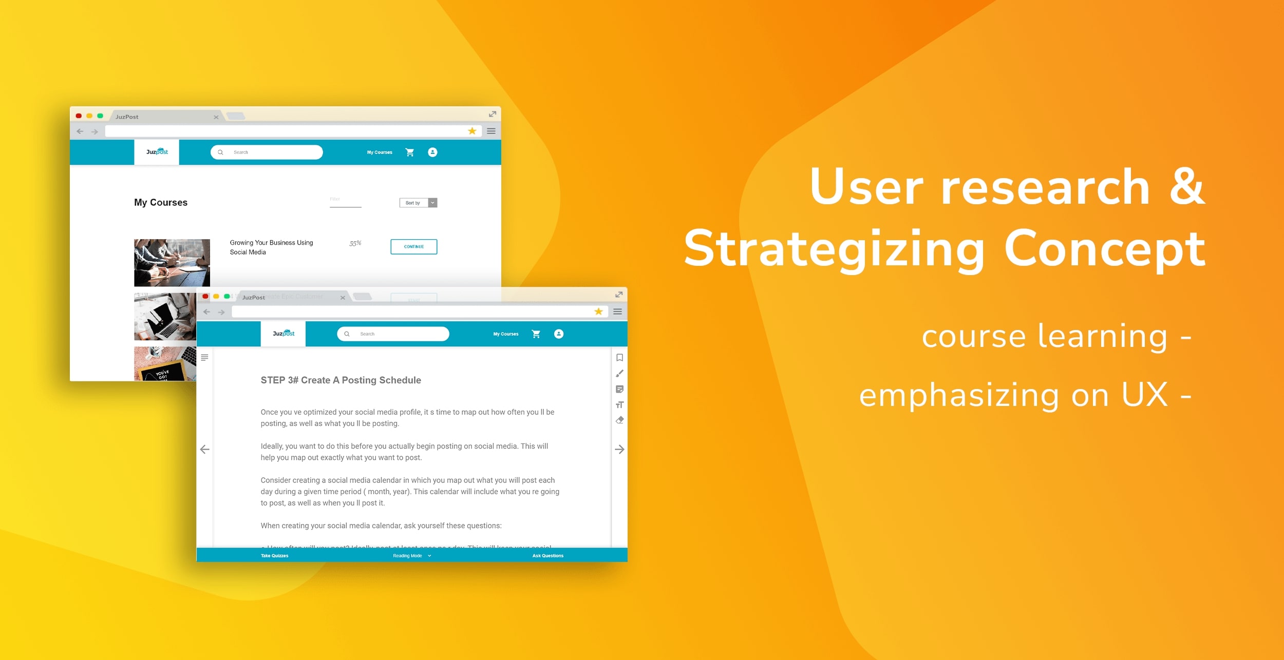
JuzPost
User research and course-learning experience concept
UX Research, UX / Concept Design
Juzpost is a Singapore-based online learning platform that offers a range of online learning solutions that teach using hands-on examples from experts in the field of study and tested research with clients.
As of July 2020, the website is closed temporarily by the stakeholder for business restructure.
I did UX research to conceptualize a new learning feature for their education website. The concept focused on improving reading experience with the addition of new feature.
It is challenging for a startup that sells text-based courses to compete against competitors that offer courses in video format.
The current business model also lack a Q&A section with the tutor that may addresses users' questions about a purchased course.
How can JuzPost provides more value to users?
How can we design an online course platform that provides more value to users?
To reach a total of one thousand student's sign-ups and improve sales per sign-up.
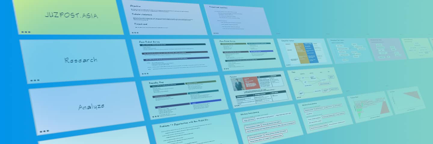
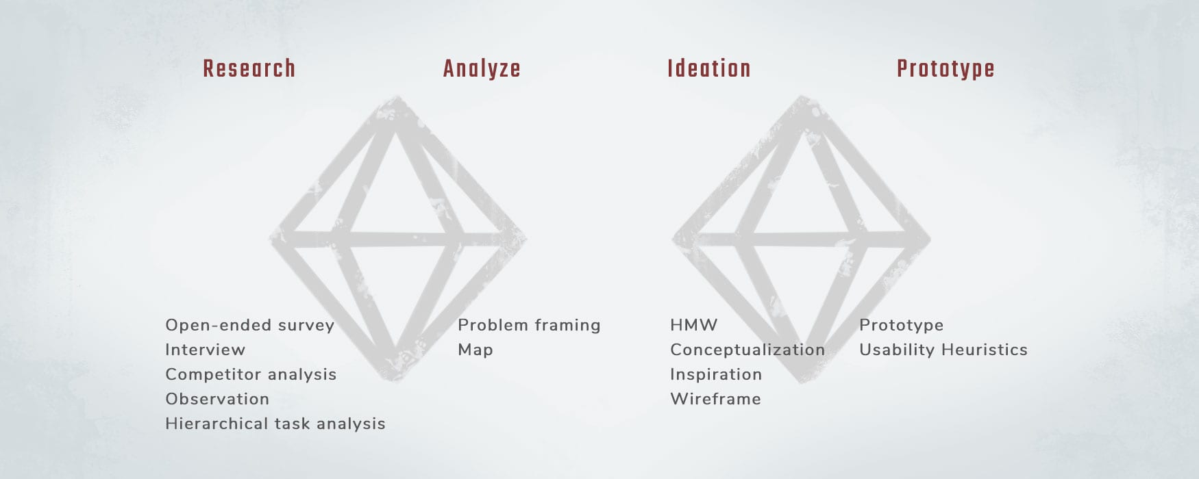
Double Diamond Framework is selected as it provides space for clear and flexible approach while keeping the objective in view.
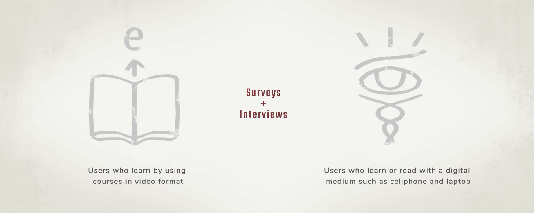
I researched the purchasing and learning behaviour of two groups of users: users who learn by using courses in video format and users who learn or read with a digital medium such as cellphone and laptop.
The data collected is then used to draw solutions in the Ideation stage to improve the course-searching experience and the course-learning experience of both groups of users.
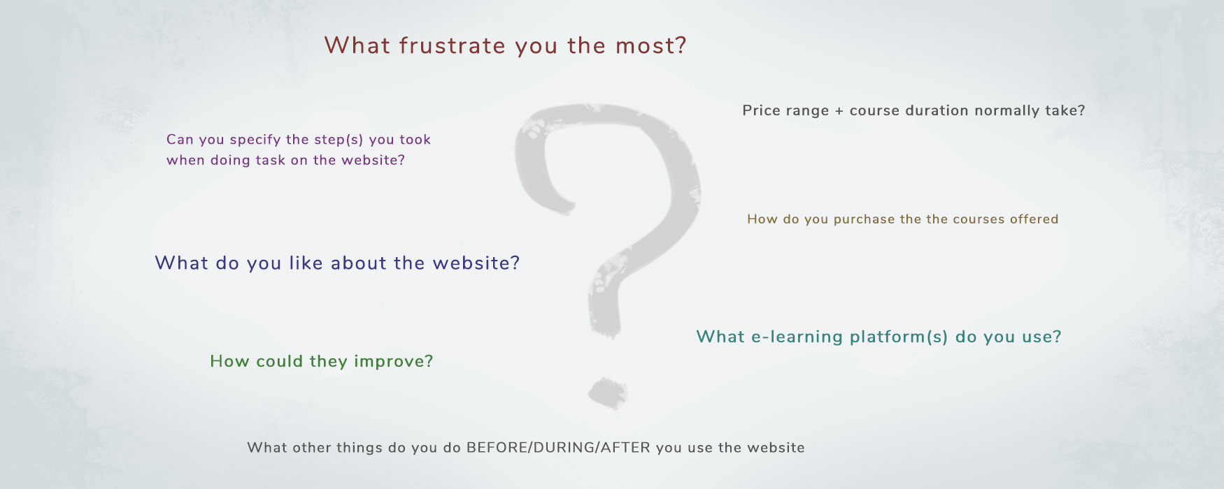
I conducted an open-ended surveys using SurveyMonkey to identify the needs and concerns of users. The questions were phrased in a neutral format to encourage users to provide feedback objectively.
Users shared both positive and negative experience purchasing and taking courses on competitors' website.
Qualitative data is also given higher preference to identify the root problem faced by users.
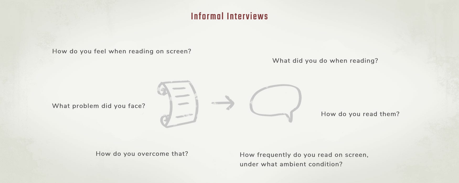
I interviewed casually a number of readers about their positive and negative experience of using a digital medium for reading purpose.
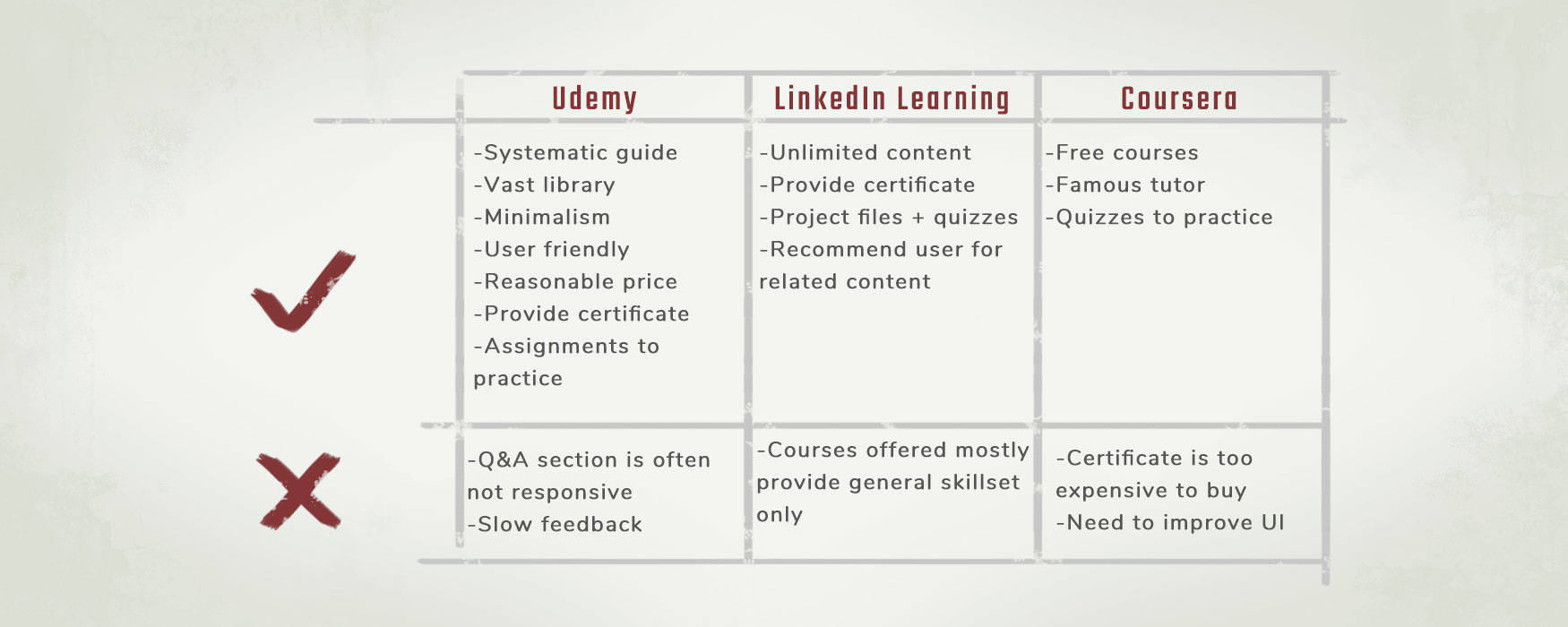
The top online course platforms used by users are identified from the survey above.
Comparison is made as both JuzPost and competitors sell education product, although the latter offers courses in video-format while JuzPost focuses on text-format.
The identified strength of competitors are then used as reference to draw solutions in the Ideation stage.
I studied the purchase behaviour and influencing factors that contribute to users purchasing books in a brick-and-mortar bookstore.
The data are then used as reference to design a user-friendly product page with marketing content catered to users' behaviour and logic.
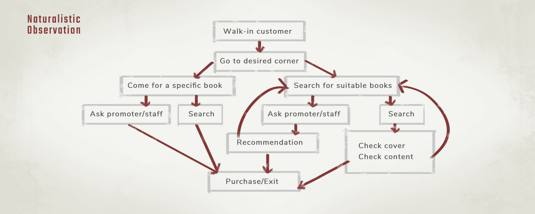
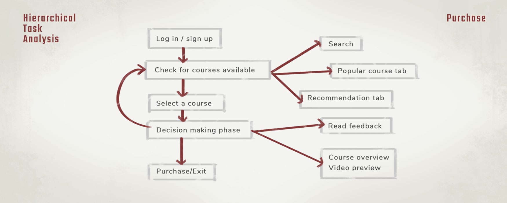
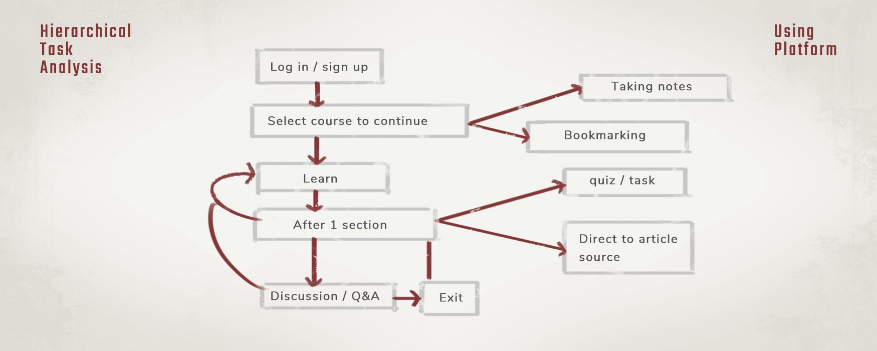
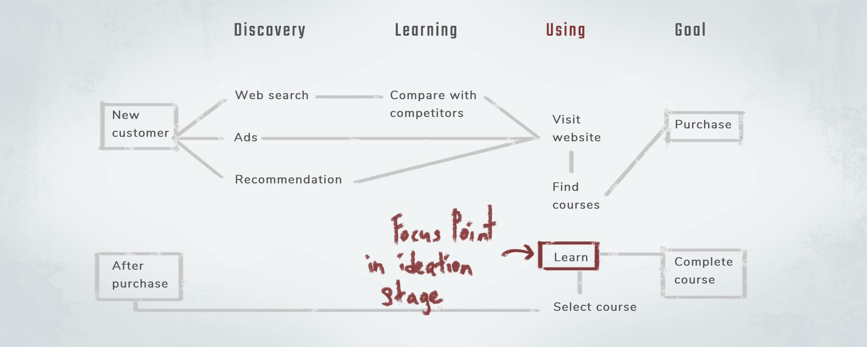
With the data collected from the open-ended surveys and naturalistic observations, a task hierarchy of purchasing a course and taking a course is summarized below:
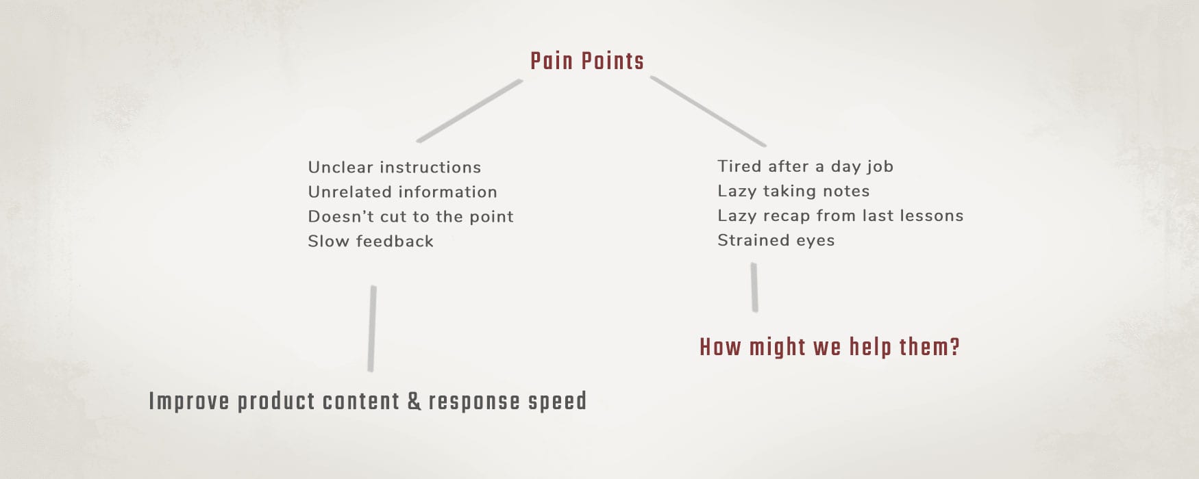
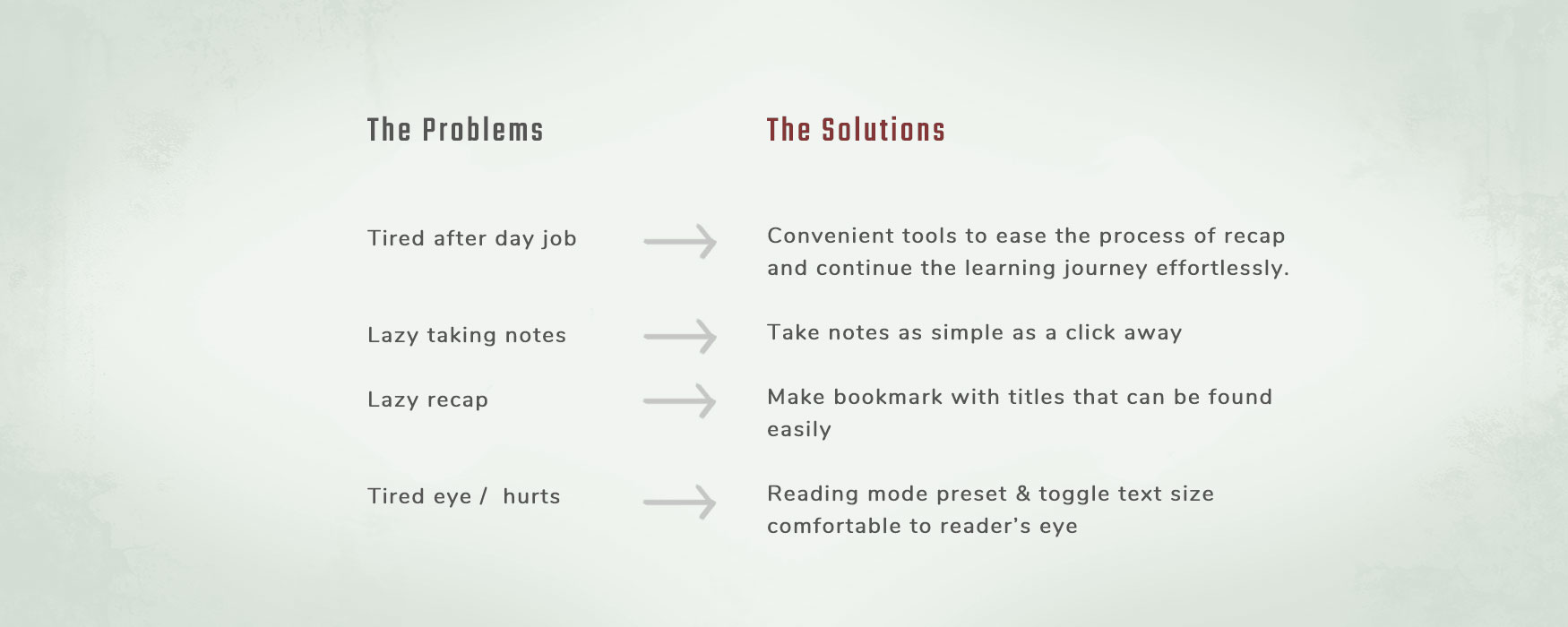
Users taking video-format courses feedback facing pain points at the content of the course itself including unclear instructions, and tutors' slow or lack of responses in Q&A. They also experience pain points related to users' behaviour including skipping courses after a tiring day job, and perceived inconvenience to take notes and recap learnings from previous lessons.
On the other hand, users who read with a digital medium reported facing eye restrain due to prolonged exposure to bright white screen of their electronic device.
Users commonly prefer minimalistic and simple design to facilitate learning process, and also faster response to questions in Q&A by the tutor.
They also use a "night mode" that applies a yellowish filter to the device's screen to protect their eyes from strong UV light.
I draw a map to provide the stakeholder a clearer picture of the entire user processes from website discovery, course search, course purchase to learning experience.
From the map, it is found that some of the pain points can be solved by improving course content and higher response rate by the tutor.
However, problems related to user behaviour require a different set of solutions, which will be the focus point in the following Ideation stage.
I came up with a concept note below to address the behaviour challenges faced by users.
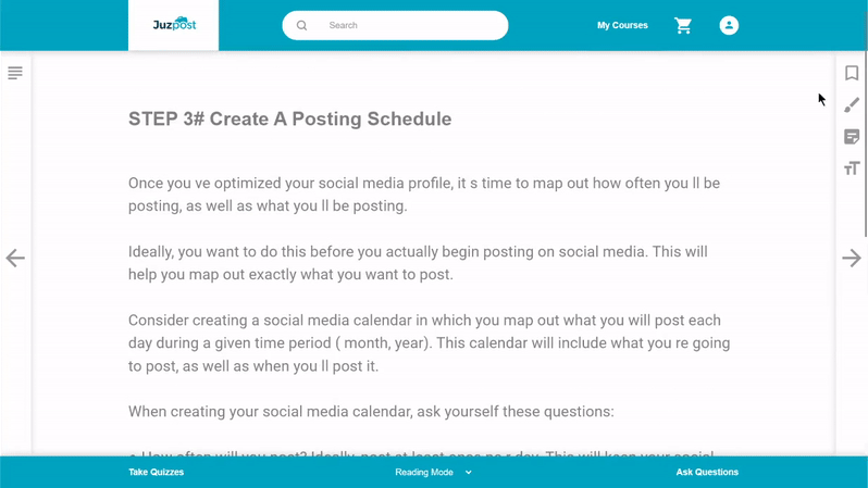
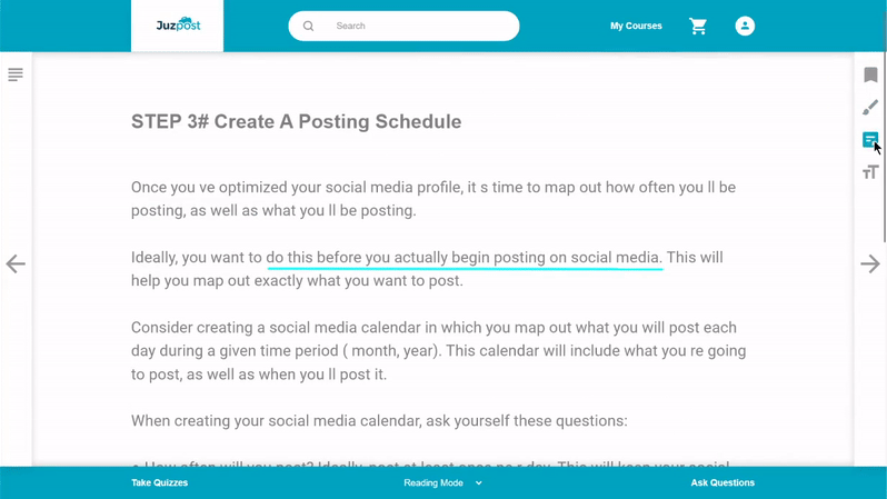
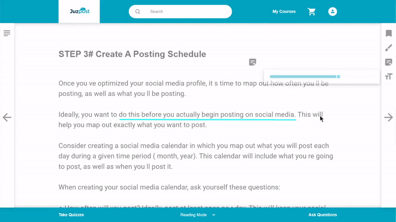
Traditional reading tools such as highlighting important points, writing notes and making bookmarks with title are made available on JuzPost to improve users' reading experience. Inspired by Adobe PDF Reader.


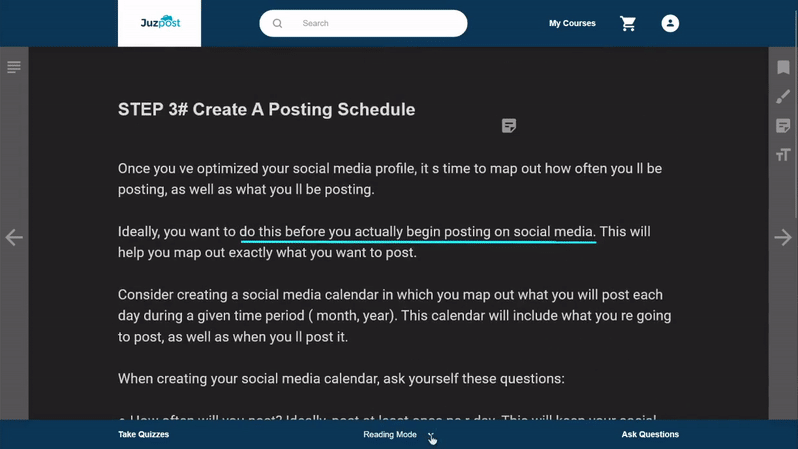
White screen strains the eyes and may even disrupt sleeping quality as the UV light tricks human brain into perceiving it's daytime, regardless of the actual time. This problem can be solved by making reading mode presets easily accessible to users without the need to install an external app.
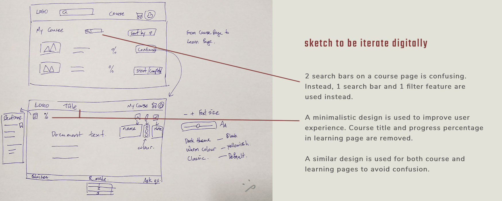
The center of the screen is the main focus of the users. By applying Gestalt principles, the added tools are grouped as side bars and bottom bar instead. The left bar toggles chapters, the right bar toggles note-taking tools, and the bottom bar toggles reading mode and preferred feature. Tools used frequently are made visible throughout the reading process.
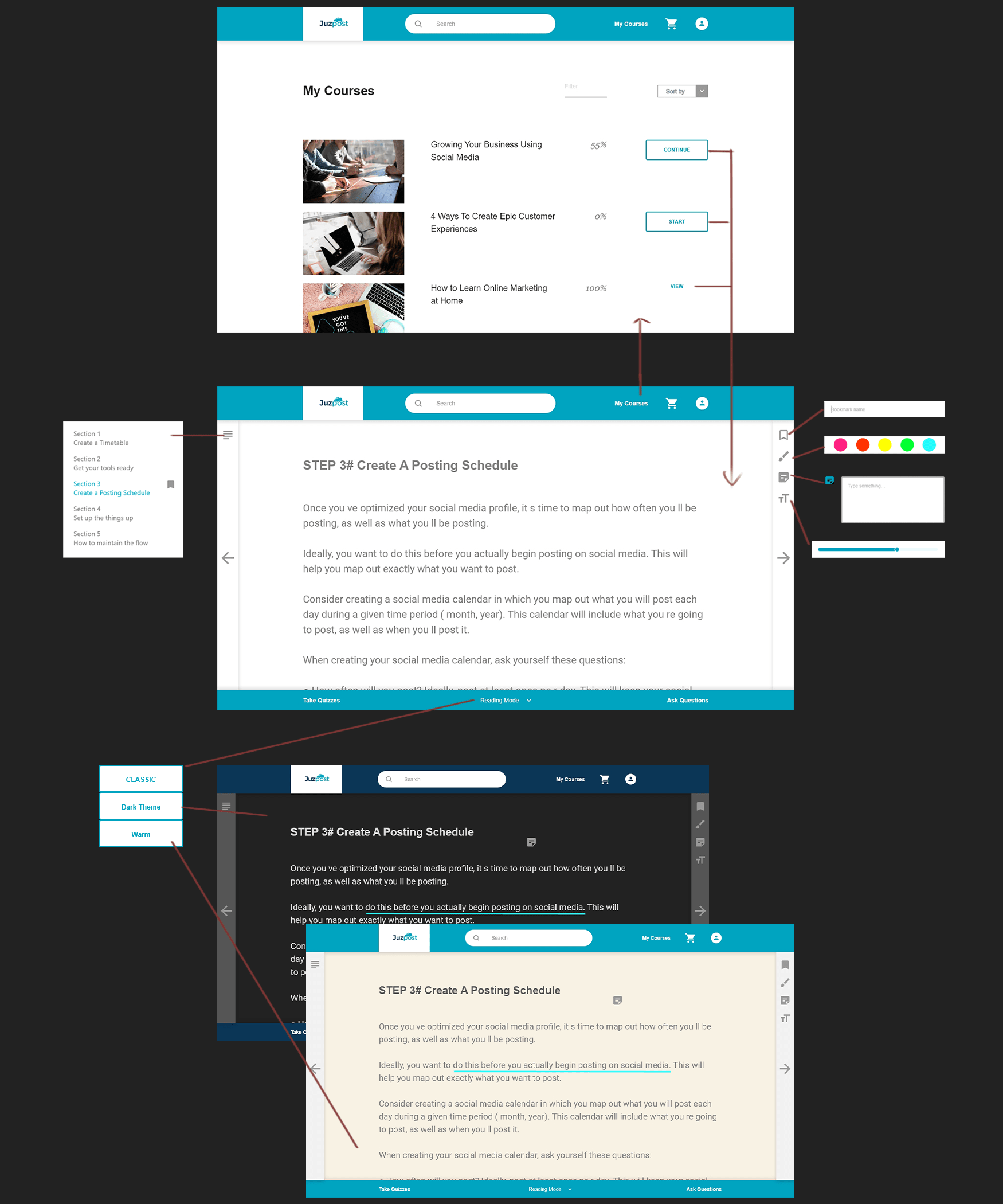
I used Adobe XD to create a prototype with interactions and transitions to enable the stakeholder to understand the overall concept of the added learning feature illustrated in the Ideation stage. Features beyond focus point of this project is not functional.
Additionally, I chose a simple and minimalistic interactions to improve users' course learning experience.
By comparing against Nielsen's usability heuristic, I found the concept lacks user control and freedom criteria. As a result, I improved it by adding an eraser tool to enable user to undo or delete.
Moving forward, a text-to-speech feature in the digital document or an optional podcast format could add more values and improve accessibility to all users, this might also enable users to continue their courses while engaging in other activities. However, more user research is required to ensure the proposed feature addresses users' needs and concerns.
"Expectation are first formed visually"
At the first glance of a design, we ask - what does this do? Is it hard to use?
Bearing these questions in mind, I design the interface with simple UI element so that it is easy to understand and easy to use by the users.
It is best to apply the Nielsen's usability heuristic before reaching the prototyping stage to save time and effort.
Stepping out of the comfort zone might yields the best result. The design proposed was considered pioneer in the market and come with its set of challenges.
However, don't relieve the uncomfortableness by making something so generic that no one hates or love, not charming and thus, no one buys.
View Next Project ↓