
Service, Consumer Discretionary, Finance
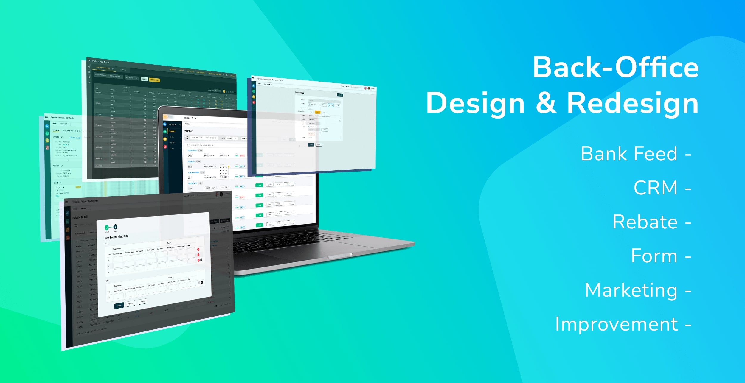
CRM Back-Office Redesign & Bank Feed Design
Research, Strategizing Concept, Design, Redesign, Optimizing
I was working on a long-term project to redesign and add new feature to the back-office based on UX evaluation and user needs.
I also designed a bank feed feature in the back-office to reduce user workload by importing the transaction directly from client’s bank account to validate the purchase ticket and do auto transaction via the back-office.
The back-office is being optimized and updated overtime.
Difficulties for Customer Service Representatives (CSR), marketers and managers to use the back-office platform for daily routine.
This is due to the user interface does not meet the users’ needs and lack of useful function to reduce their workload.
How can we improve the back-office to help users to do their work more efficiently and reduce their workload, hence improve the business performance?
To increase the performance of the business by improving the Customer Service Representatives (CSR) and managers’ work efficiency.
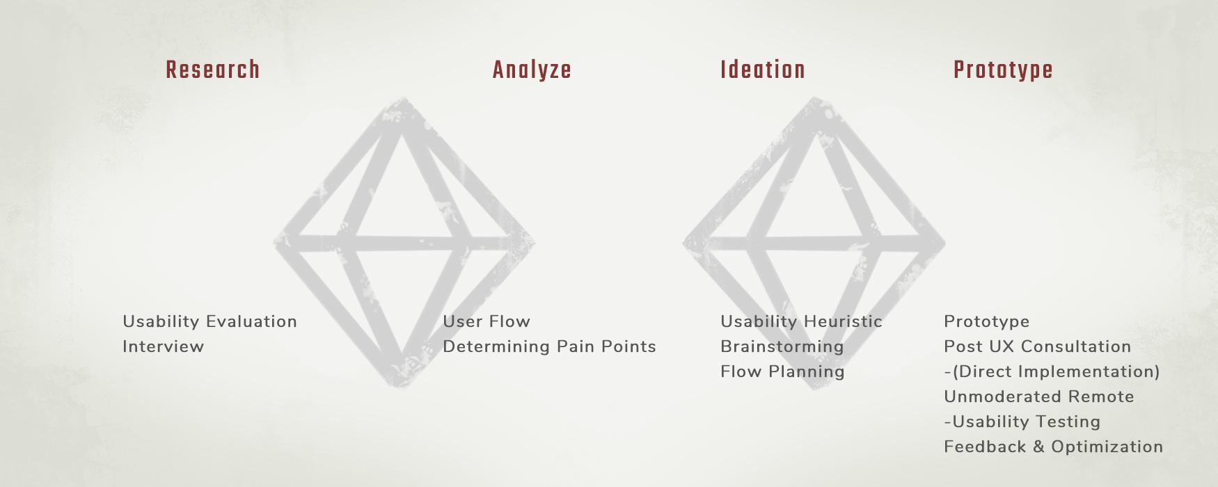
The framework and method used throughout the project.
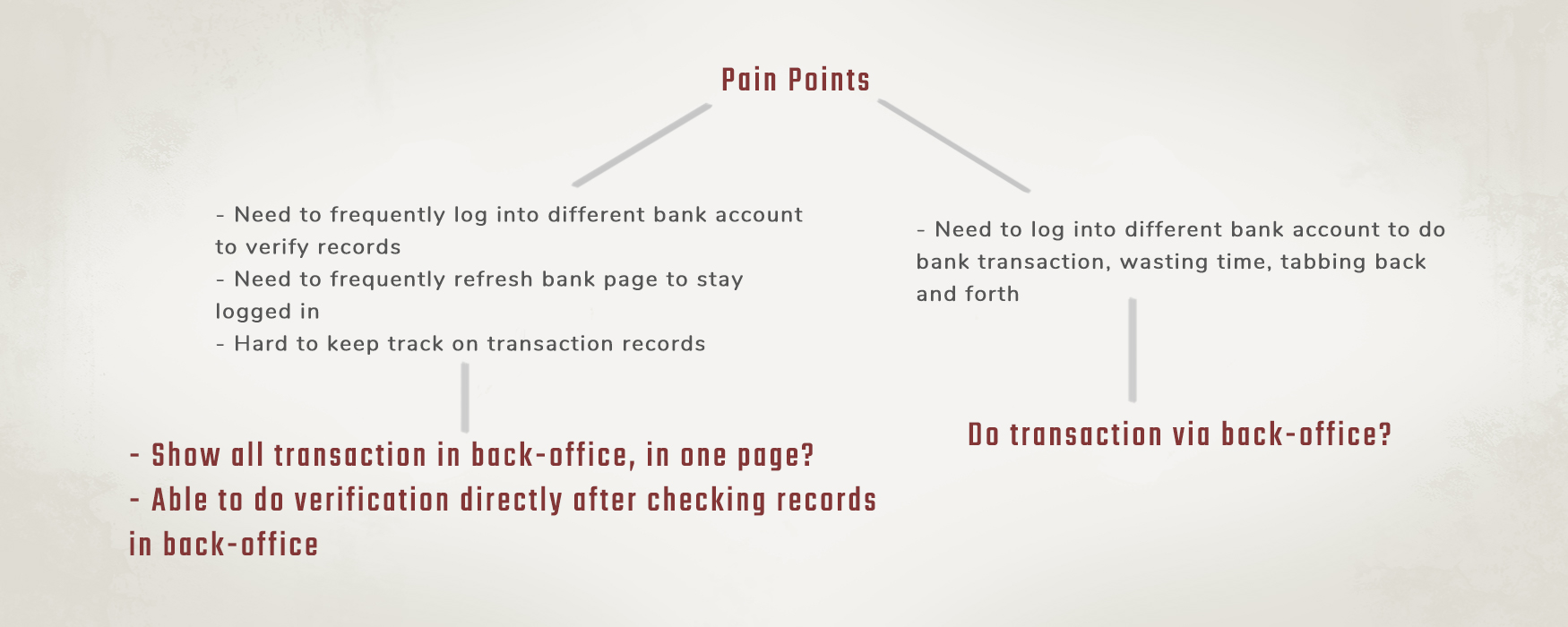
The users are having a hard time when doing the transaction checking process. Why is that?
They have to log into different bank and account on other tabs in browser to check the latest transaction, otherwise they have to keep refreshing every page when they are not using it.
They also have to do the checking in a traditional way by printing out the transaction history on a paper and cross them out individually.
I’m very thankful to my project lead that he gave me the opportunity to take over the research and interview session with the client.
After the process of drafting wireframe, discussion with developers and client, we proposed the design with iterative improvement later on.
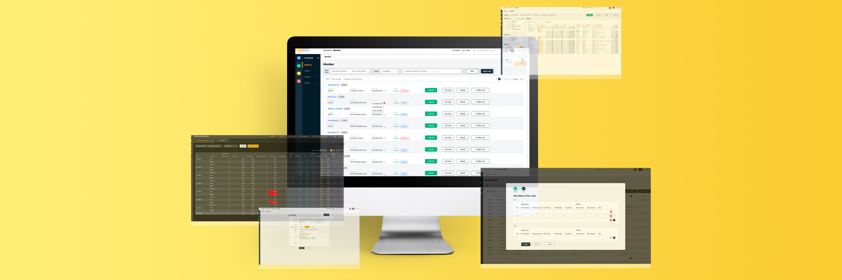
We implement every bank account’s transaction with required details in one page, the page re-sync automatically with a timer to avoid spam, ability to auto-login and able to do mark-up for verified transaction or create ticket via the transaction records.
This way, users are able to work efficiently without re-log and refresh the transaction pages.
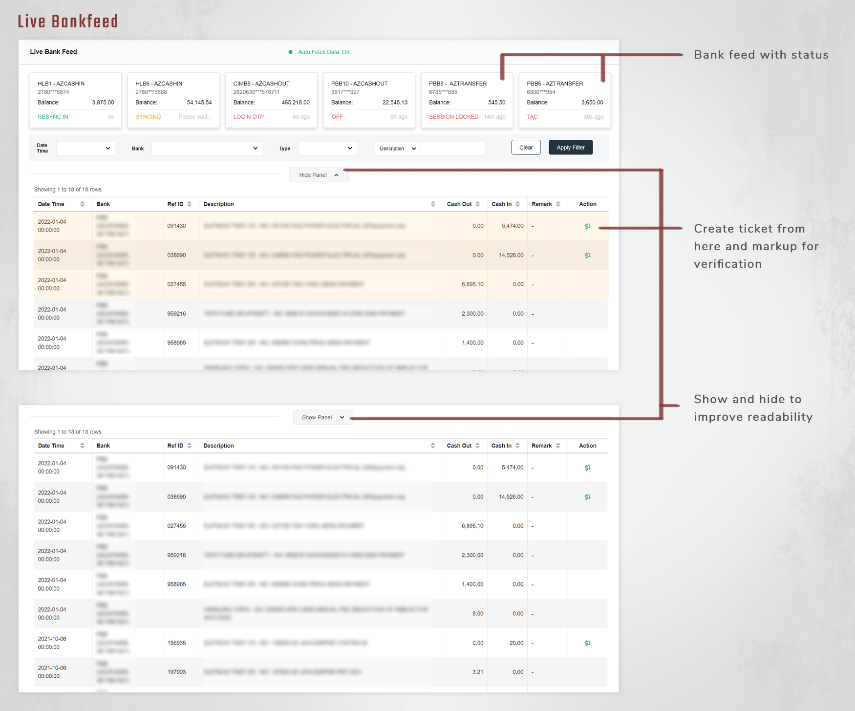
We also implemented the auto transfer function to complete a bank transaction process which included OTP validation and receipt screenshot.
The user flow and wordings were improvised and refined after dogfooding and client’s feedback.
The biggest challenge here is for the developer to standardizing and implementing all bank transfer function including the refresh timer because of the unique flow of each bank.
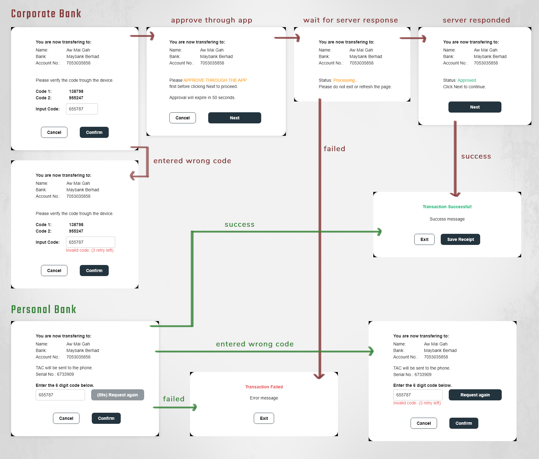
For future plan, we decided to automate and streamline the process with Optical Character Recognition (OCR) for automated data entry to keep up on the increasing operational demands.
It can increase business efficiency and improve the productivity due to its ability to scan receipts.
This helps eliminates the need for CSR to spend hours to key in data thus keeps them from majority human error. Moreover, the converted data can be quickly and easily edited when needed for further verification.
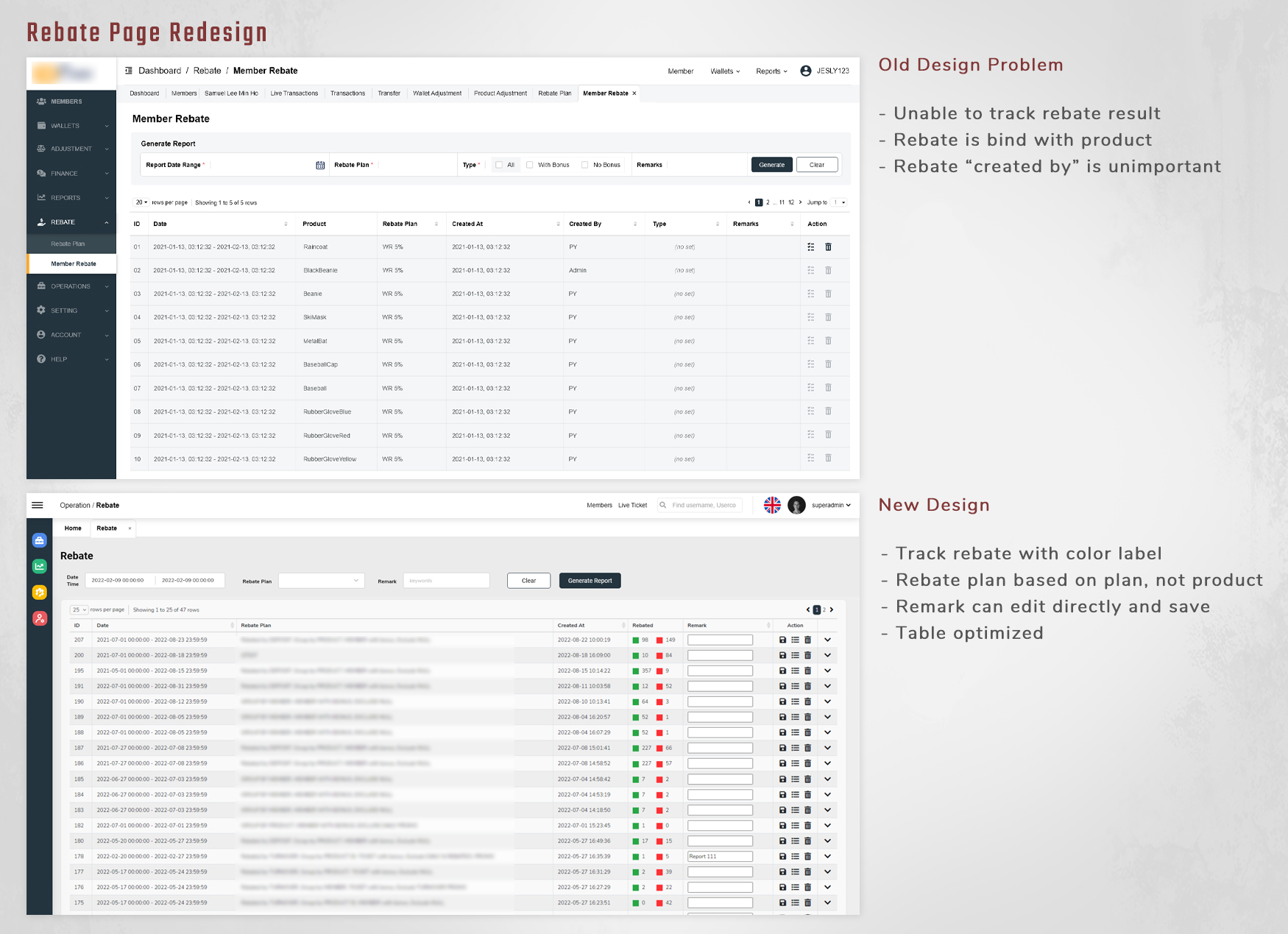
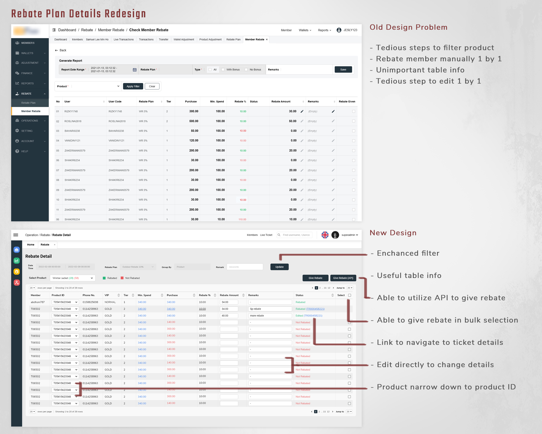
As the business keep expanding, the customer rebates are getting complex as more rebate programs are introduced.
The rebate management were carried out by multiple departments, it is confusing and overwhelming for them because they manage via the aid of spread-sheet between teams before data entry.
The misunderstanding in spread-sheet caused frustration and inaccuracies, hence mismanage of rebate make loss in business.
So how might we improvise the rebate planning feature to help users reach greater efficiency and accuracy?
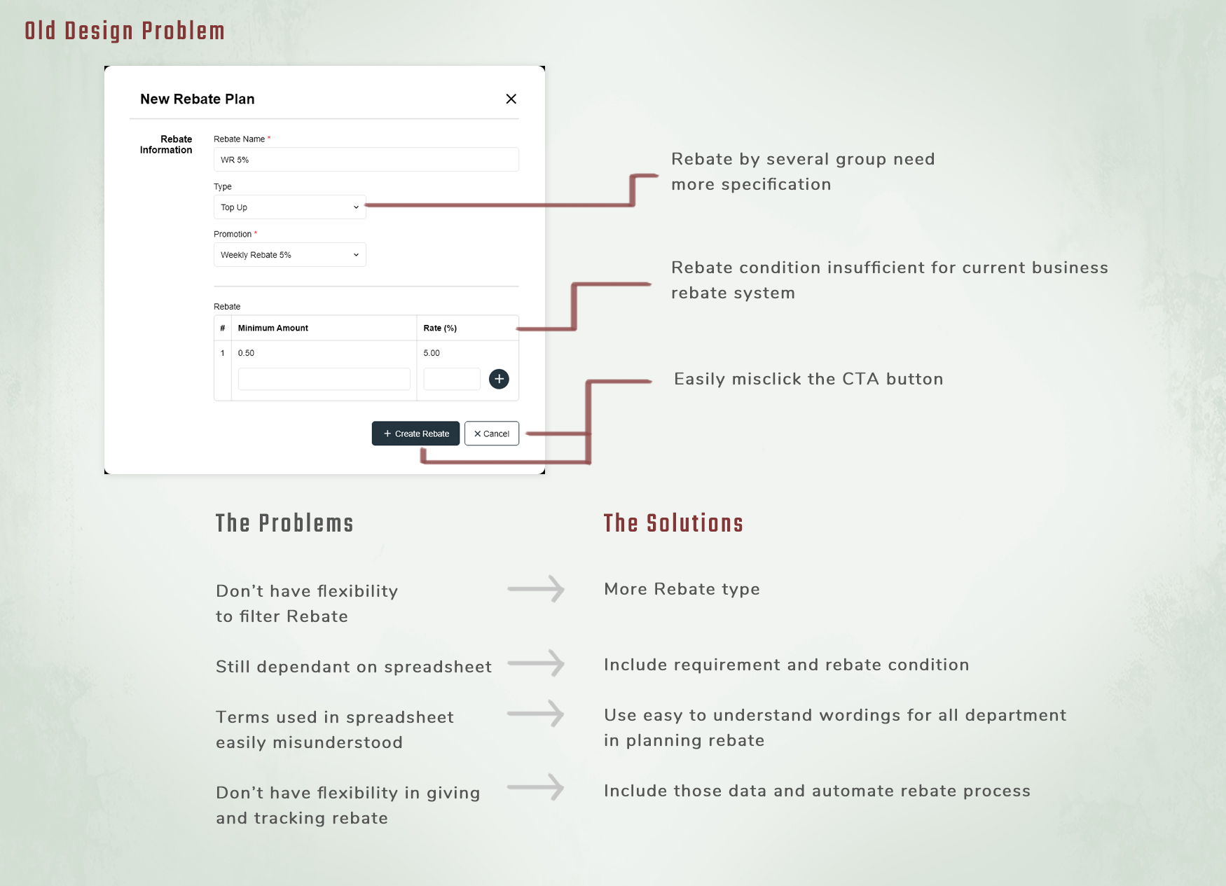
The aim of this design is to increase accuracy, efficiency and maximizes profitability. We identified the rebate type and requirement for the business from the users and understand their flow in a traditional way before redesign the feature.
The design includes type of rebate, category, promotions, filters, conditions and tier of members. Due to the massive information and data entry are required during the rebate planning, we decided to keep things simple and easy to understand.
We separate them into 2 wizard steps and guide them step by step. This was also intended to prevent users confused about the input relationship and missed them out during the process.
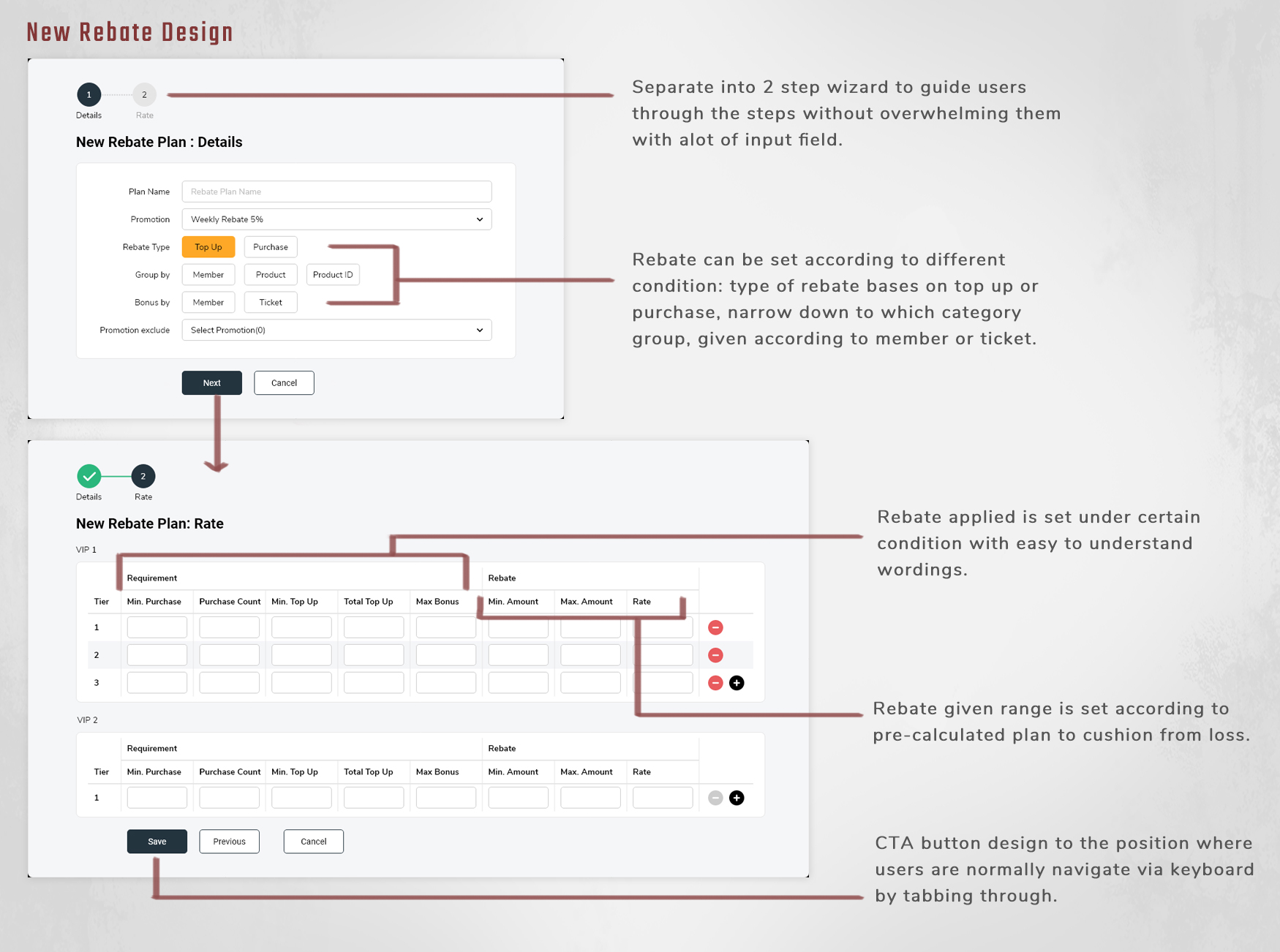
Instead of manually giving the rebates to customers in a traditional way, this design was able to filter out the target customer list and give rebate in an automated process, thus it became easier and scalable.
This data-driven rebate management feature was able to track the effectiveness of the rebate planned.
The design was refined and tweaked according to the user’s feedback.
Customer service representatives (CSR) have to submit from hundreds to thousands of tickets per day.
By observing the CSR doing their daily routine, we noted down their habits and the frequency of mistakes during the process and review them afterwards.
The analysis pointed out the underlying problem was the structure of the user interface on the ticket form. CSR normally using keyboard instead of mouse to tab through the ticket form field, the label field however, wasn’t that important to them as they already know because they are doing this every day.
The existing design structure interrupts the reading pattern of the user. Moreover, some of the UI was unable to tab through, which is frustrating and time consuming.
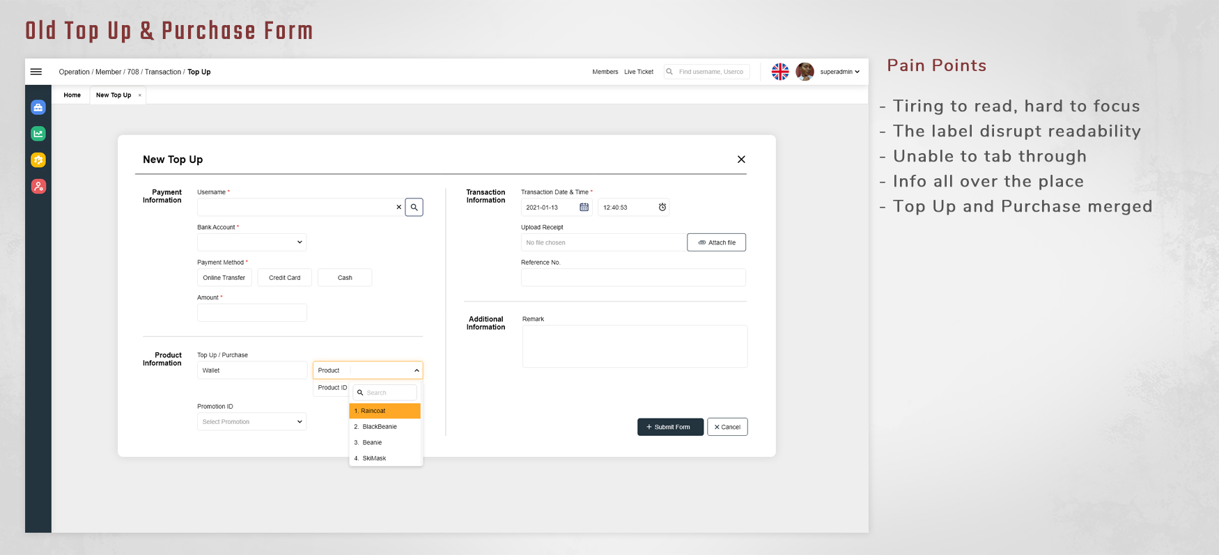
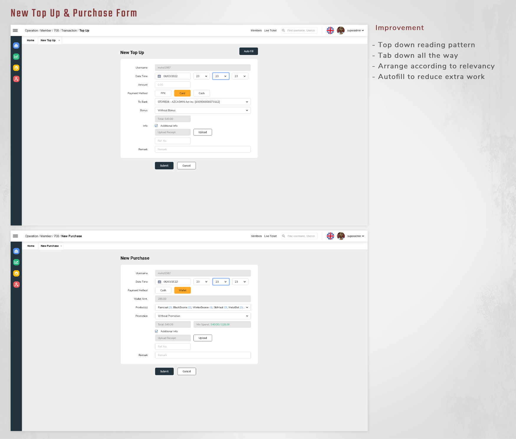
The UI was redesigned and prioritized on the CSR daily practices.
The label and input were placed side by side, so when the user tab through, their eyes can focus on the input top-down and tab through selection consecutively. All the input field were fine-tuned to be able to tab through, final action buttons were aligned with the input field to improve the reading pattern.
The feedback was very positive, the eye focus and comfortability were greatly improved during their daily routine, the work flow are more efficient because mistakes are greatly reduced, thus saves more time.
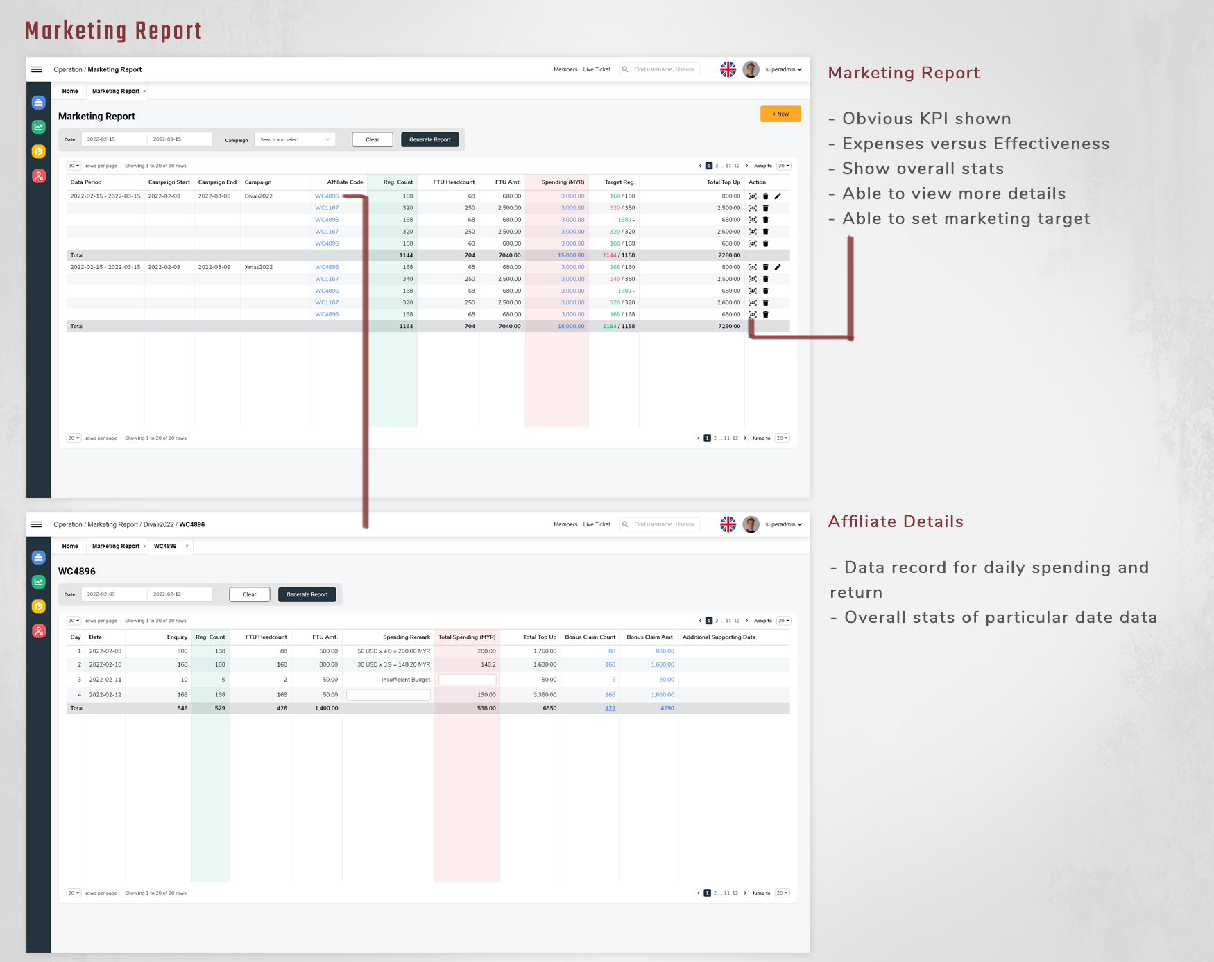
The marketing team usually record the spending using spread-sheet and track data using multiple reports, which is very inconvenient to manage promotional campaign.
Moreover, there will be data mismatch and communication problem when it comes to calculating expenses during monthly accounting.
A report for both marketing team and accountant are crucial in the department, for both tracking marketing performance as well as managing accounting numbers.
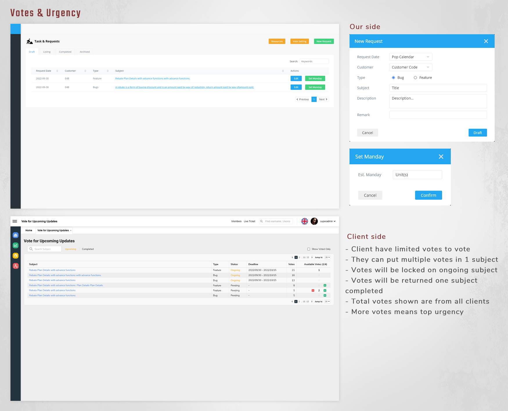
We designed a voting page for our client to let them vote on which features and bug fixes they prioritize, we will then keep them updated about our progress.
Our account manager will collect requests and upload to the platform for our client to vote, the number of votes per person are designed to be adjustable. Our client can put multiple votes on one task to emphasize the priority.
This is to understand and focus on the clients’ top priority, users’ biggest pain points, and the urgency. Then, our developers are able to adjust the deadline by managing the resources with this feature.
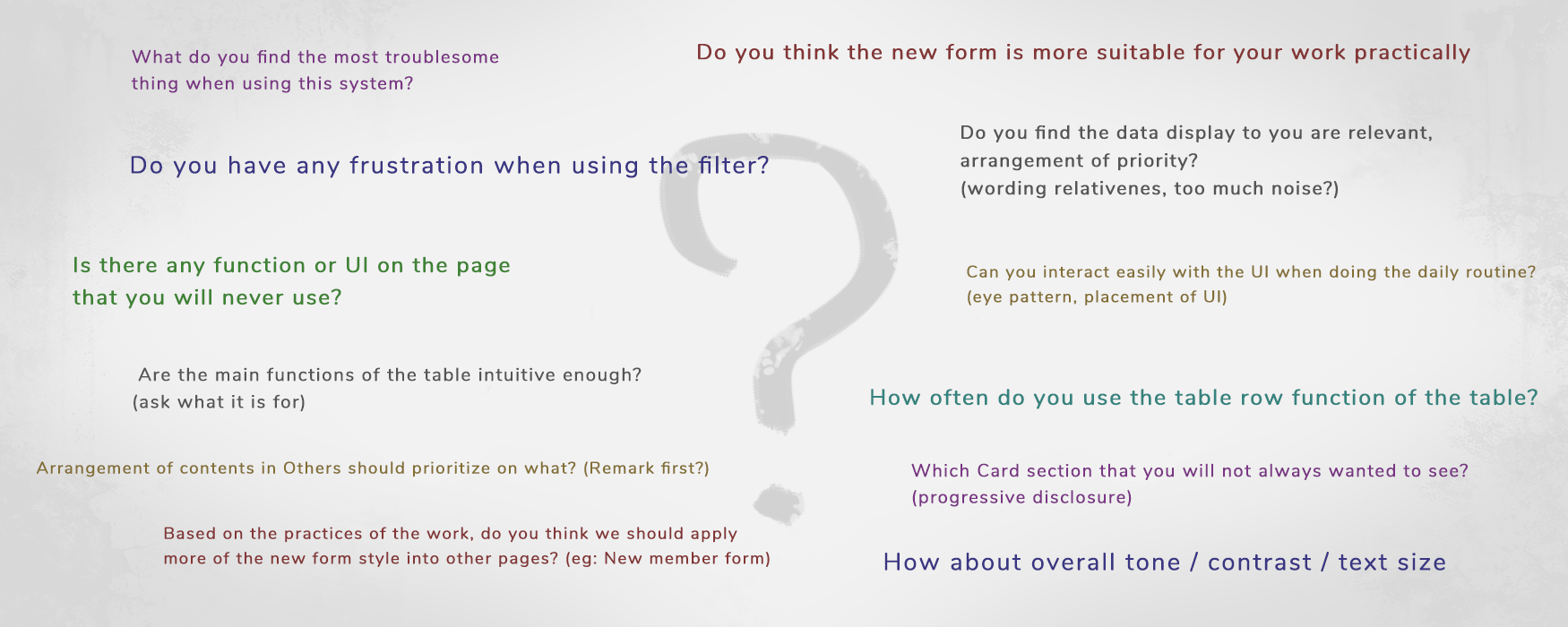
Our team initiate this optimization by interviewing the CSR regarding the processes that are frequently used for their daily routine.
We gather the feedback from the users and evaluate the existing design accordingly.
The interview questions included relevancy of information, steps, conveniency, what problems do they encountered when using it.
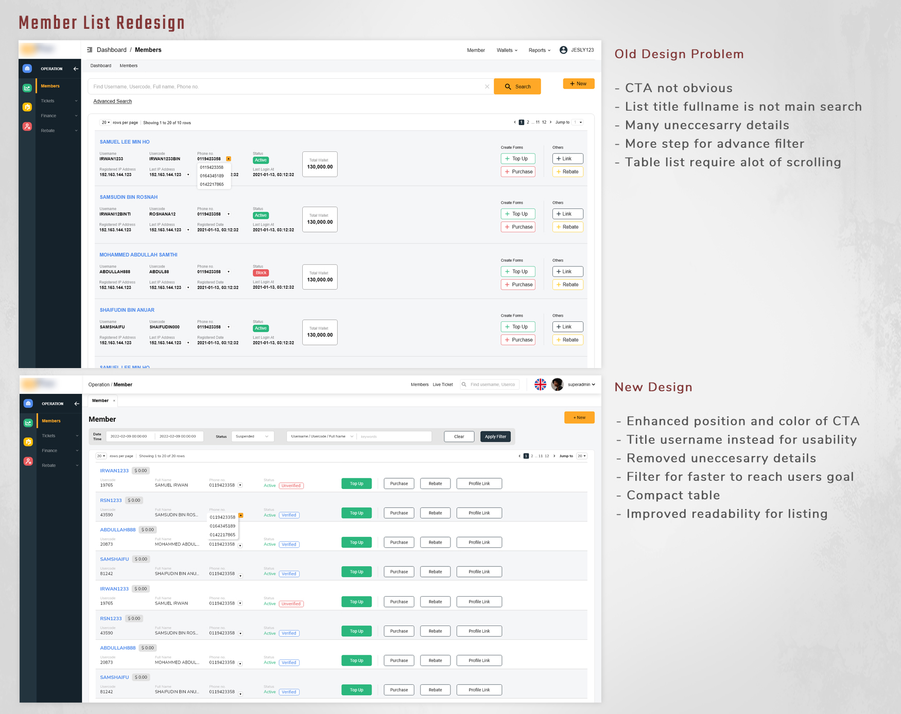
After the ticket form improvement as stated above, we started on the member page where all members are listed.
There were a lot of unnecessary information such as IP addresses were removed, other information and action buttons are rearranged by priority.
It is advisable that we list out the member in table form in the future to compact the list and improve clarity.
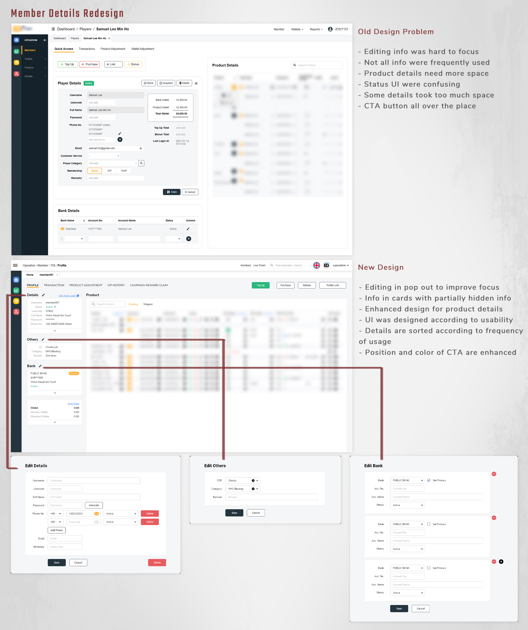
Member details page also redesigned by categorized them into different section, and hide seldom used data.
The info editing also changed from edit on page into overlay pop out editing, this is to prevent all the interface clump together and mislead the user about the editing process.
Other than that, some other interface elements that is being used in most pages such as filter and table were also optimized by rearranging and reducing negative space.
During the users’ site visit, we sit side by side with the CSR to observe their work process and involve ourselves in the daily routine to develop empathy towards them.
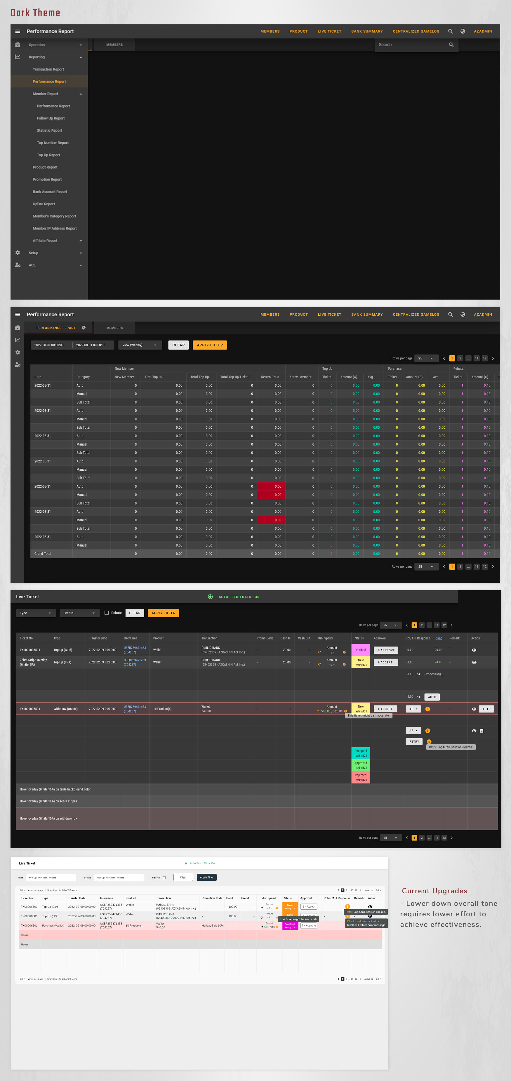
Eyes are tiring when starring at the screen for long hours, it is a problem that everyone had. The interface colour is bright, we suggested to redesign the interface into a dark mode in the future.
Its’ a challenge because different type of data and various status with colours were hard to fit in darker theme, a lot of elements needed to be changed.
Alternatively, we can lower down the brightness of the interface for the time being to see the results as it only requires lower amount of effort to achieve higher effectiveness.
As the business keep expanding, additional feature and elements into existing design is inevitable.
The challenge here was that the current solution might not work for future additional changes, because new changes might not fit in the current layout, it might need a new design to compensate it.
Hence, we need to think of a solution to include the possible changes in a long run. It is not practical to change the design every now and then just to fulfil the present requirement.
The balance between the needs of client and user has to be achieved.
We did our research and design based on the user who use the back-office, clients’ requirements are also important but sometimes might not the best for the user.
There is the need to carry out meeting and discussion to get everyone on the same page and agreement before going into the design and development.
View Next Project ↓